
WOW!house 2026: The Details That Caught My Eye (and One I Would Do Differently)
Every summer the Design Centre fills with rooms that are pure creative expression, free from the practicalities of family life. Here is what stayed with me at WOW!house 2026, from luminous stone to labelled sockets, and the one clever idea I am not sold on.
Each June I make the trip to the Design Centre, Chelsea Harbour for WOW!house, and it is the event I never miss. Twenty-two full-sized rooms, indoors and out, each one created by a leading design studio paired with a top international brand, all under one roof in a 600 square metre showhouse. It is part exhibition, part theatre, and it is the best barometer I know for where the interior design industry is heading. This year a few themes kept reappearing as I moved from room to room. Here is what caught my eye.
Luminous stone
One of the first things I noticed was how many designers were doing something interesting with stone and light. Not stone as a worktop or a floor, but stone lit from within. Alabaster and onyx have a natural translucency, and when you put light behind them they glow. It looks stunning and I am all for using natural stone in your home.

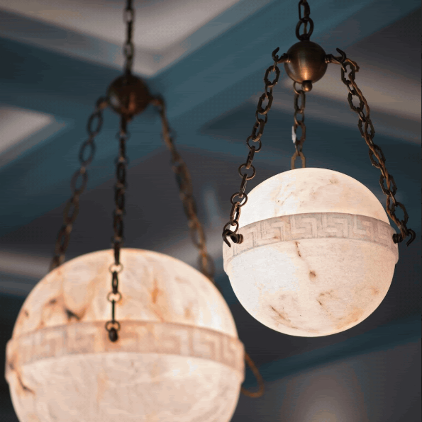


Above you can see Studio Mark Andrew’s glamorous basin vanity in the THG Paris Powder Room, alabaster and onyx lighting and Tom Palmer’s ‘Vault’ the Artorius Faber Entrance Garden by The Gardenists.
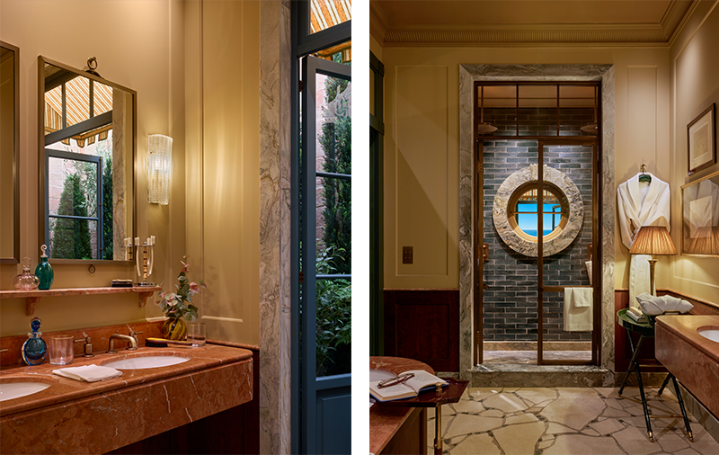
Ca'Pietra took stone in a quieter direction. In the bathroom designed by De Rosée Sa, they wrapped a doorway in natural stone and layered it with tile. The room felt cinematic, nostalgic and atmospheric. It was the kind of space that asks you to slow down and stay a while, which is no small thing in a showhouse where everyone is moving through at pace.
The (almost) invisible air conditioning
With the heatwave we had this summer, air conditioning was on everyone’s mind. WOW!house has 170 metres of ductwork concealed in the roof this year, designed with Calibre Climate, so the whole house stays cool without a single unit in sight. The brief, as designer Henri Fitzwilliam-Lay put it, was simple: we want to feel it, but we do not want to see it. That is exactly right.
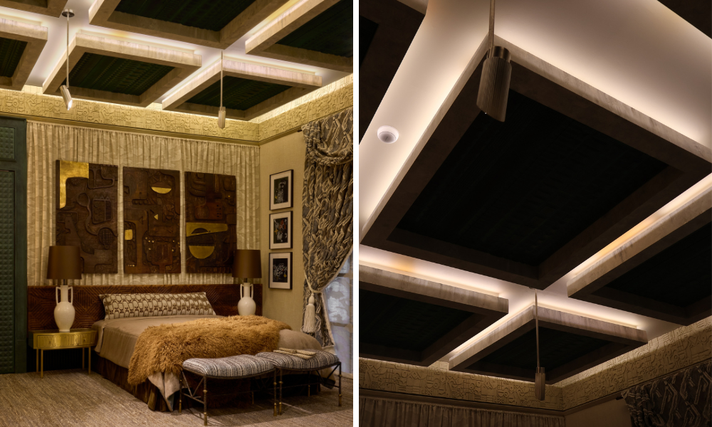
The clever part was spotting how each room hid it. In Albion Nord's Turnell & Gigon Group Drawing Room, an octagonal space topped with a dome and a roof lantern, a 1.5 metre curved diffuser is tucked into the illuminated perimeter at the base of the dome. In Henri Fitzwilliam-Lay's art deco Misia for Casamance Group Bedroom Suite, the outlet is concealed inside one of the sculptural ceiling panels. Both of these I loved. The cooling is built into the architecture, so you genuinely cannot see it.

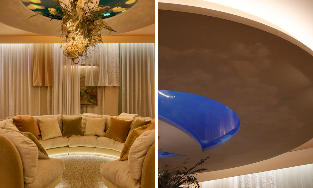
Other rooms ran the air behind fabric. Russell Sage Studio's Nucleus Immersive Room hides ceiling speakers behind a semi-transparent stretched Fromental fabric, and the cool air passes through it. Studio Duggan's Black Edition at Romo Speakeasy Salon has a tented fabric ceiling, so the outlet was set low, below the frieze, to keep the fabric from rippling.
Here is where I will be honest, because that is what these visits are for. I am not sold on air conditioning behind floating, layered fabric. It is beautifully done and the engineering is genuinely clever, but as a working designer I think about the years after the photographs are taken. Fabric near a constant flow of air collects dust, and anything that moves or sits in the airflow is harder to keep looking crisp. Give me the cooling hidden cleanly in the ceiling, integrated into plasterwork or joinery like the Albion Nord dome or the Misia panel, every time. It is the more practical choice, and in my experience the practical choice almost always ages the best.
Soft greens
If there was one colour running through the whole house this year, it was a soft green. It is that gentle, slightly grey green that feels calm and a touch nostalgic, and it turned up again and again.
It was the signature shade in the Kitchen and the Morning Room, but it kept reappearing in quieter ways too. A mottled verdigris finish in one room, the lanterns in the Garden Folly, an architectural detail in the Bedroom Suite. It is a colour I already love and use often, so I was pleased to see it having a moment. It sits beautifully with brass, with wood and with natural light, and unlike a bolder shade it is very easy to live with year after year.


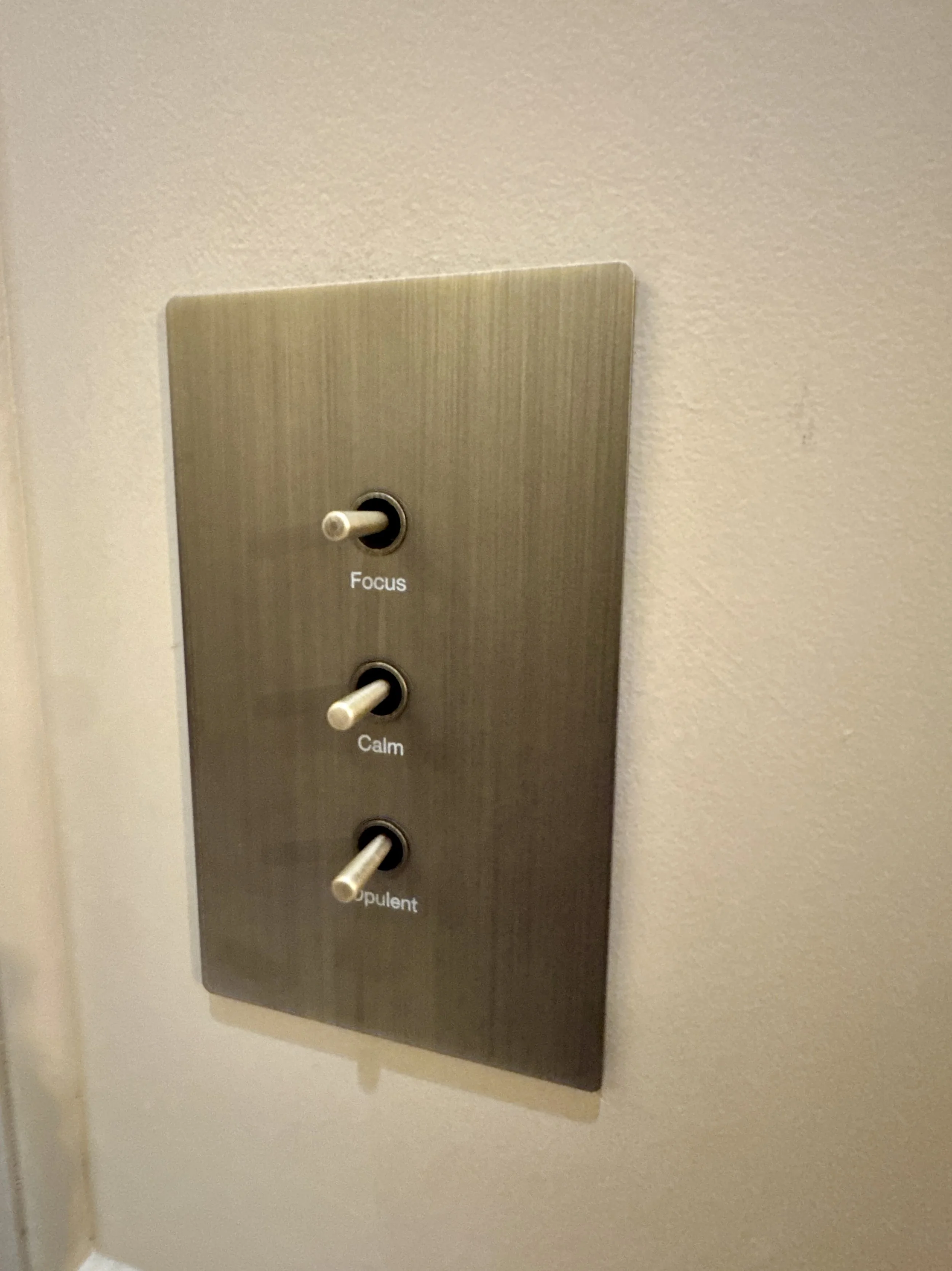
The clever little detail: labelled sockets
My favourite small detail of the whole show was also the most practical. Corston had switches with labels on them, so there is no more guessing which one runs which lamp. You can set the mood of the whole room, switching between day and night mode, or focus, calm and opulent.
Layered lighting is essential to getting a room right, and this lets you change the whole feel of a space in a second. Imagine three or four different moods for one room, ready whenever you want them. I love a clever, useful detail, and this is exactly the sort of thing that makes day to day life in a home feel more elevated.


What it all tells me
What I take away from WOW!house every year is a sense of direction, and this year it felt clear. Stone used in more sculptural, light-catching ways. A move towards soft, liveable colour. And, encouragingly, real care given to the practical things, the cooling, the lighting, the humble socket, handled with as much thought as the furniture and the fabrics.
The best rooms were not the loudest. They were the ones where the clever thinking was hidden and everything simply worked. That, in the end, is what good design is. Beautiful to look at, and quietly brilliant to live in.
If you are planning a project in Kent or London and want a home that balances both, I would love to help. Have a look at my Full Service Interior Design, Design Only and Design Consultation packages, or book a quick Discovery Call to get started.